 Back
Quickteller Case Study: Improving Quickteller Mobile App
A UI & Product Audit of InterSwitch's Consumer Payment App
- ROLE
- Product Designer
- INDUSTRY
- Fintech
- TIMELINE
- 3 Weeks
- YEAR
- 2026
Introduction
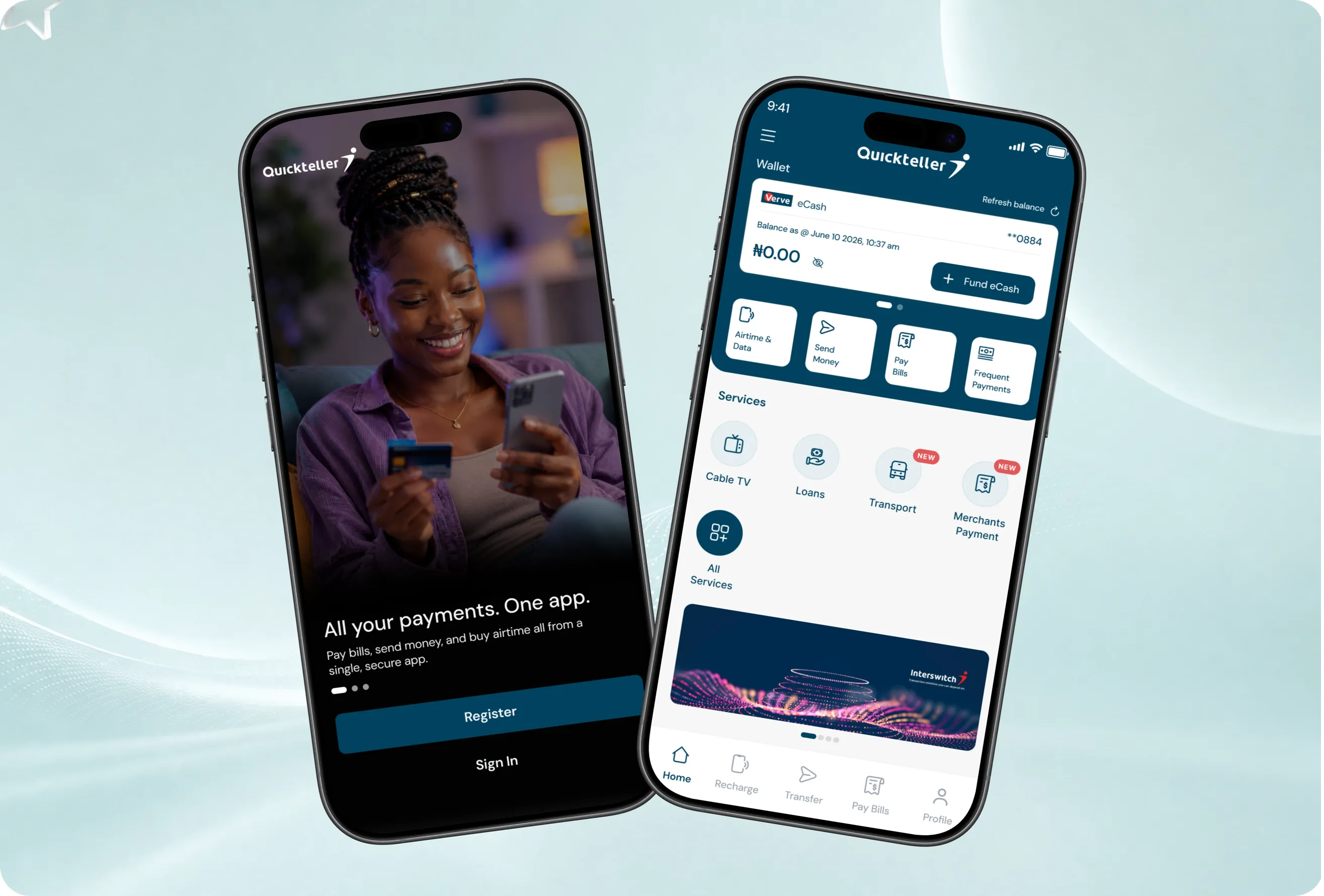
As a product designer interested in fintech, I downloaded Quickteller to understand how one of Nigeria's most established payment platforms translated its powerful infrastructure into a mobile experience. While the app successfully delivers its core functionality, I noticed several visual inconsistencies, interaction gaps, and product logic issues that introduced unnecessary friction.
Rather than redesign the app from scratch, I chose to improve it. Existing users are already familiar with its navigation and workflows, so preserving that familiarity was just as important as addressing usability issues. My goal was to refine the experience, strengthen trust, and improve clarity while keeping the product's core structure intact.
This case study explores the problems I identified, the reasoning behind each design decision, and how thoughtful refinements can create a more polished and intuitive user experience.
The Problem
During my initial exploration of the app, I noticed a pattern that went beyond surface-level aesthetics. The issues I encountered were not random they fell into a consistent theme: an app that had grown feature by feature over time without a unifying design language to hold it together.
The result was an experience that felt inconsistent. Buttons that didn't behave like buttons. Labels that didn't explain what they meant. Interactive states that gave users no feedback. Payment options that appeared in contexts where they made no logical sense. Small decisions, stacked on top of each other, quietly eroding the trust of every user who opened the app to move their money.


- 1
Visual Inconsistency Across the Interface
The app had no consistent design language. Icon styles changed between screens some outlined, some filled, some illustrated. Component treatments were applied differently depending on where you were in the app. The bottom navigation used red as an active state indicator a color that communicates error or urgency everywhere else in the product.
- 2
Interaction & UX Gaps That Created Friction
Several core interactions were designed in ways that made simple tasks harder than they needed to be. The button to fund a user's eCash wallet arguably the most important action on the homepage was a small, right-aligned text link at the top of the wallet card, invisible unless you knew to look for it.
- 3
Product Logic Issues
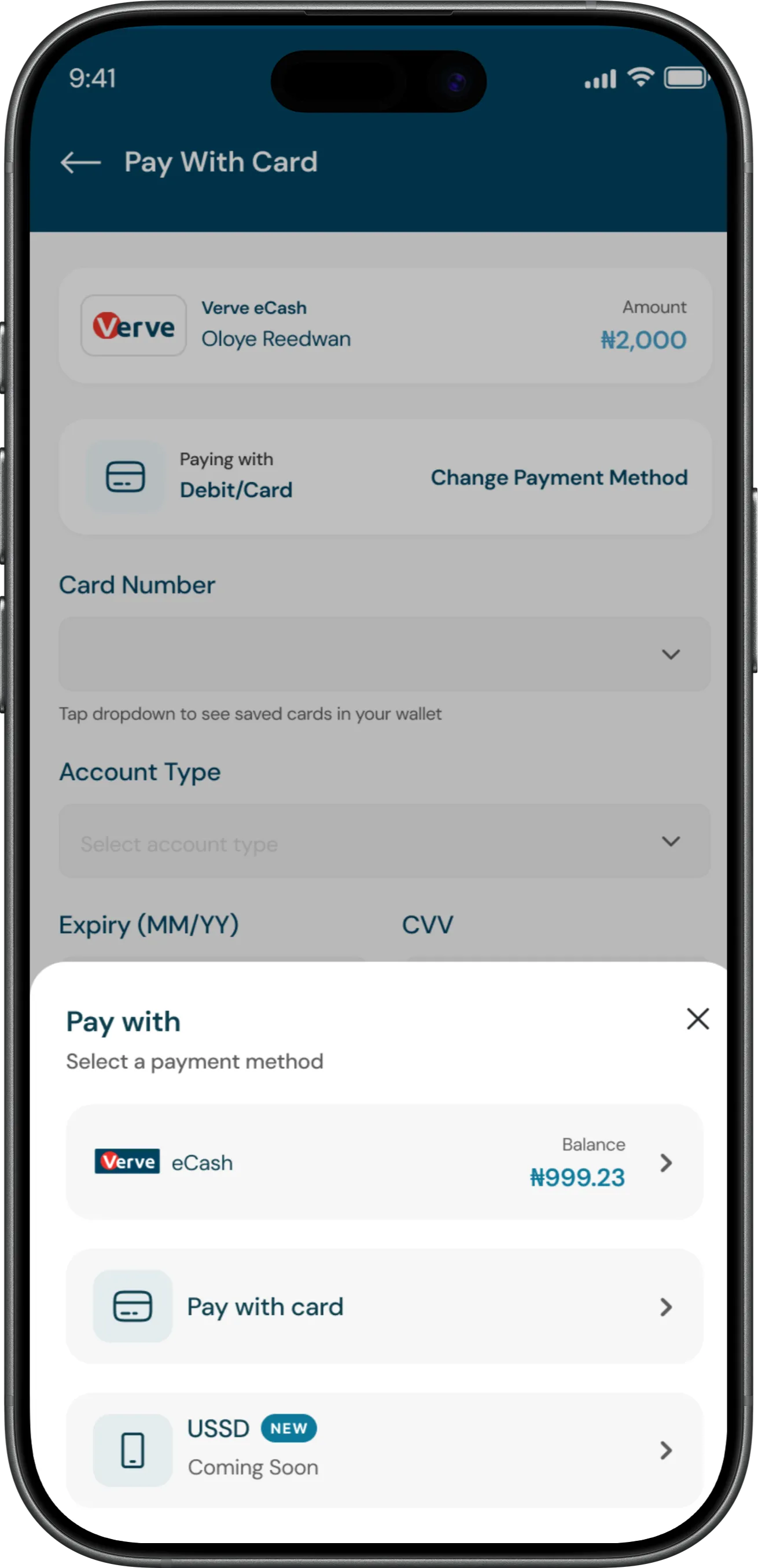
This was the most significant finding, and the one that went beyond visual design entirely. When attempting to fund an eCash wallet, the app presented eCash itself as a valid payment method. Selecting it resulted in a circular transaction money was debited from the eCash wallet and immediately credited back to the same wallet, with zero net change and zero value to the user.
The Solution
Before diving into the screens, it is important to establish what this redesign is and what it is not.
This was not a redesign for redesign's sake. I did not open Figma with the goal of making QuickTeller look different. I opened it with a specific list of problems that needed solving, and every decision made in this project traces directly back to one of those problems. If something was working, I left it alone. If something was creating friction, eroding trust, or communicating the wrong thing to the user, I fixed it.
The result is a redesign that should feel immediately familiar to any existing QuickTeller user. The navigation structure is the same. The core flows are the same. The brand colors, typography, and overall personality of the product are unchanged. What changed is the consistency with which those elements are applied, the clarity with which each screen communicates its purpose, and the logic with which each interaction responds to the user.
A user who opens the redesigned QuickTeller should not think "this looks completely different." They should think "this feels right" and not be able to immediately explain why. That invisible quality ,the absence of confusion, the presence of trust was the goal of every decision made here.
Home Page
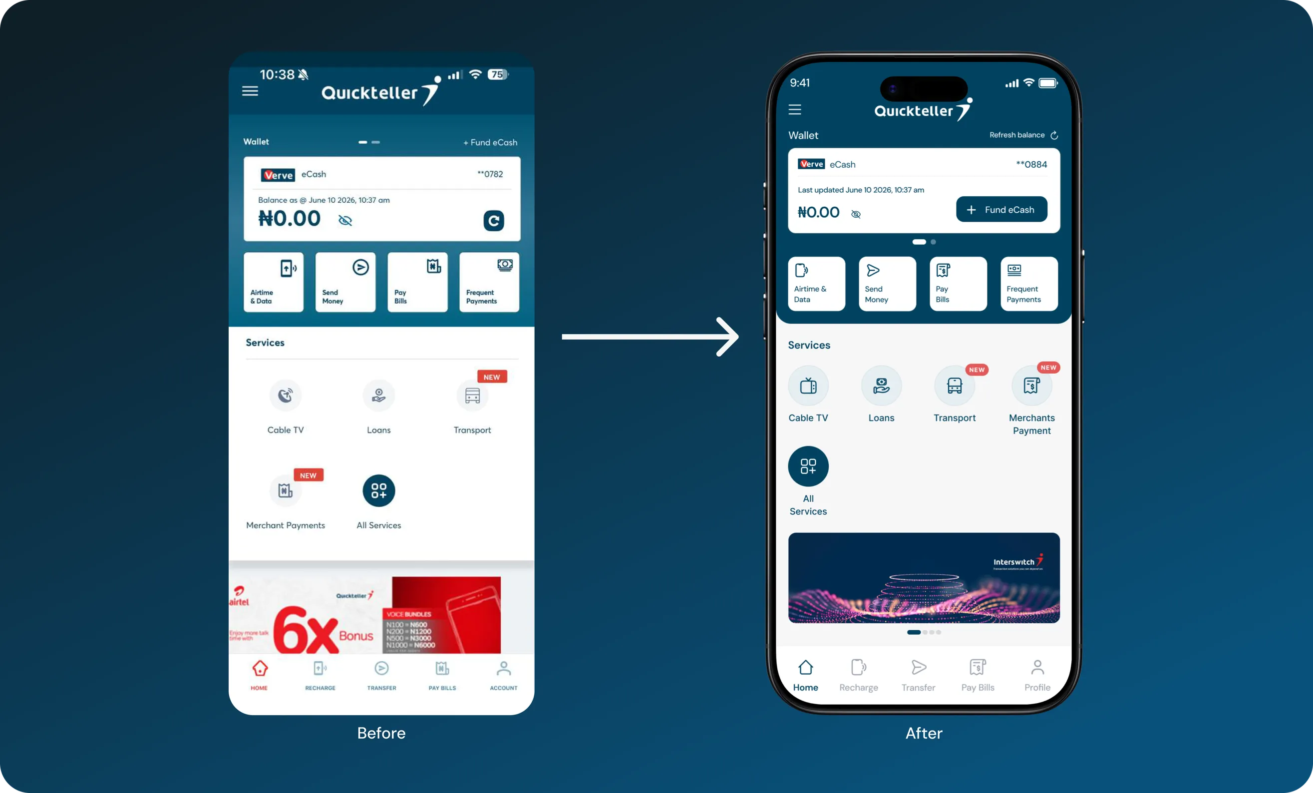
The home screen is the user's first point of interaction, making clarity, consistency, and accessibility essential. My focus was to simplify the experience, improve visual hierarchy, and make key actions easier to discover.
What was wrong
- Poor Visibility of Key Actions.
- Inconsistent Iconography
- Misleading Navigation States
What I Changed and Why
- Made Funding More Accessible
- Unified the Icon System
- Improved Navigation Clarity
Recharge Screen Redesign
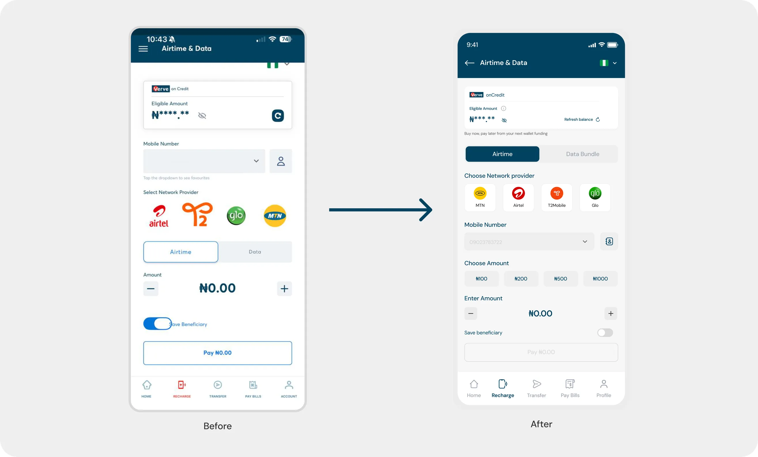
The recharge screen is a frequently used feature for airtime and data purchases. My focus was to simplify the transaction flow, improve clarity, and create a more intuitive experience.
What was wrong
- Poor Transaction Flow
- Unclear Credit Information
- Inconsistent Network Logos
What I Changed and Why
- Reorganized the Transaction Flow
- Improved Credit Clarity
- Standardized Network Selection
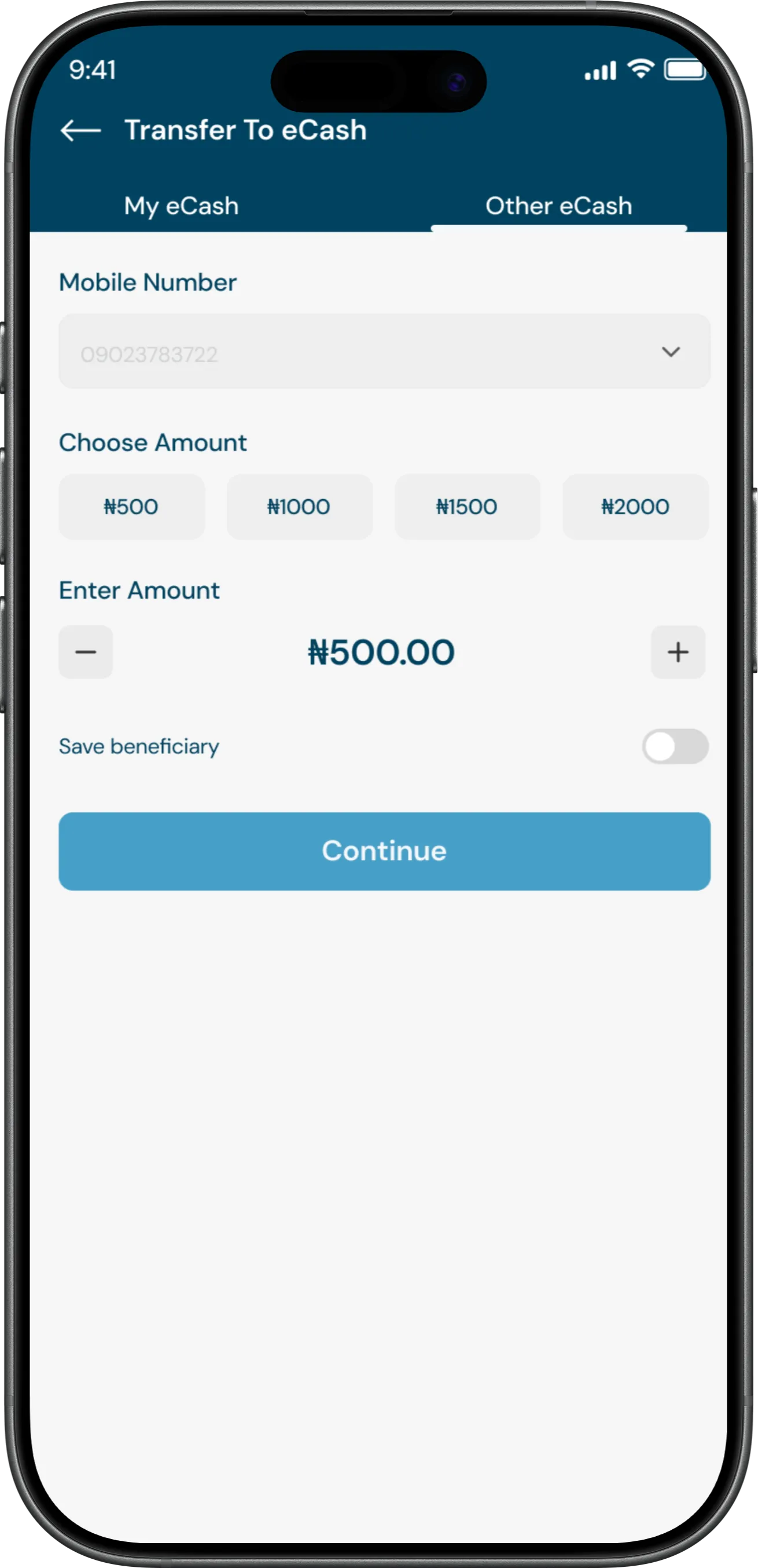
Transfer Screen Redesign
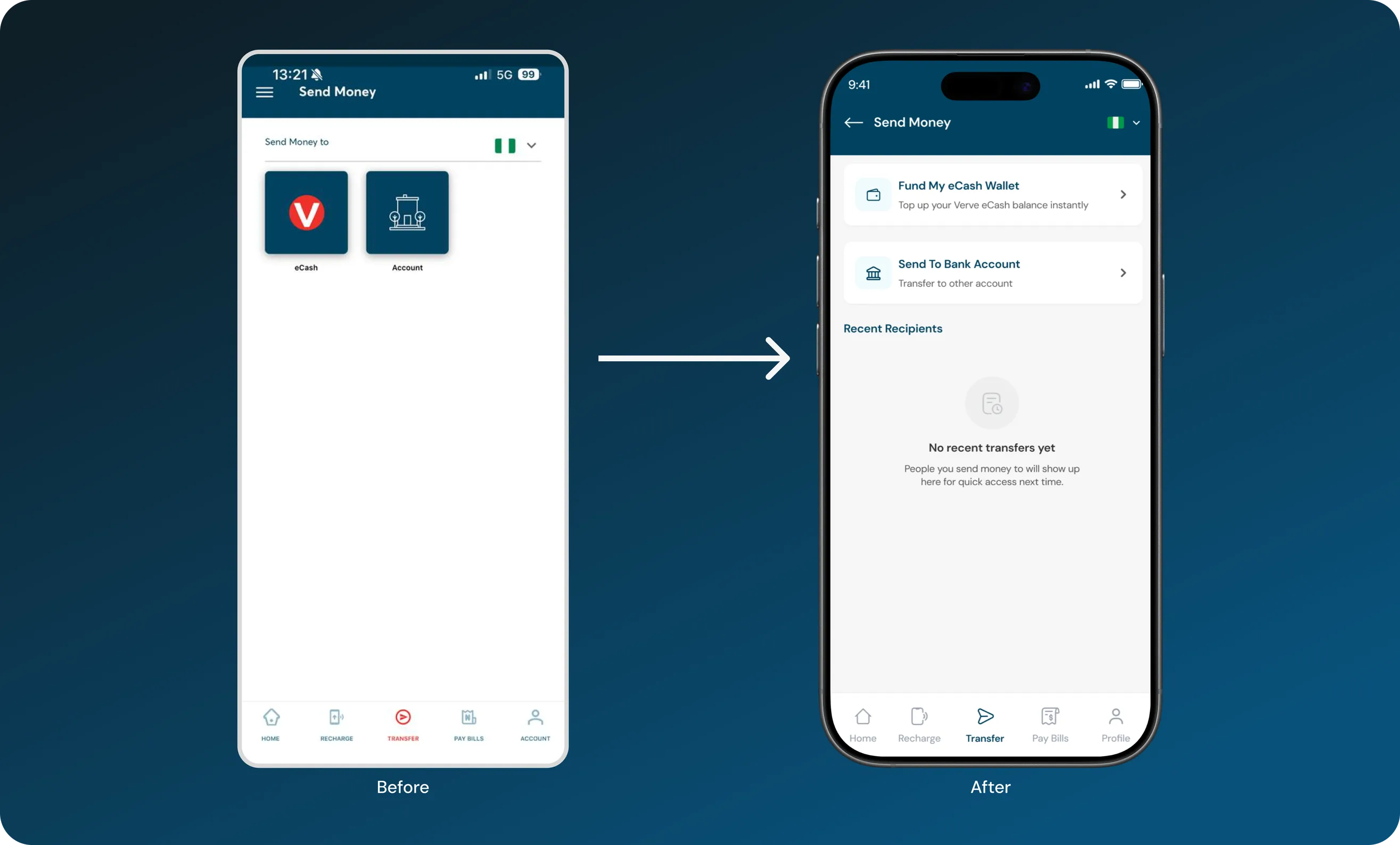
The transfer screen had usability issues that made sending money less intuitive. My focus was to improve clarity, simplify transaction options, and create a more helpful experience for both new and returning users.
What was wrong
- Unclear Transfer Options
- Poor Use of Screen Space
- No Recent Recipients
What I Changed and Why
- Made Transfer Options Clearer
- Simplified the Layout
- Introduced Recent Recipients
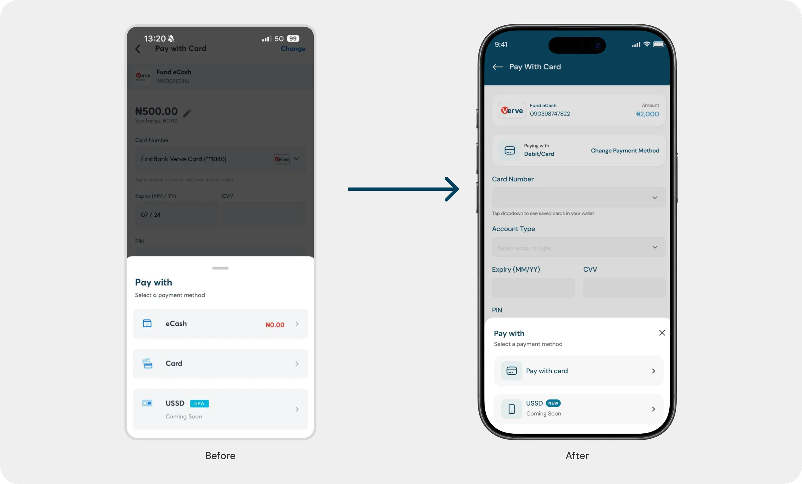
Payment Screen Redesign
During my audit, I discovered a payment logic issue that allowed users to fund their eCash wallet using the same wallet as a payment method. My focus was to eliminate confusing payment options and ensure a more logical, seamless transaction experience.
What was wrong
- Incorrect Payment Options
- Lack of Contextual Filtering
What I Changed and Why
- Introduced Contextual Payment Options
- Simplified Payment Selection
- Improved Transaction Logic
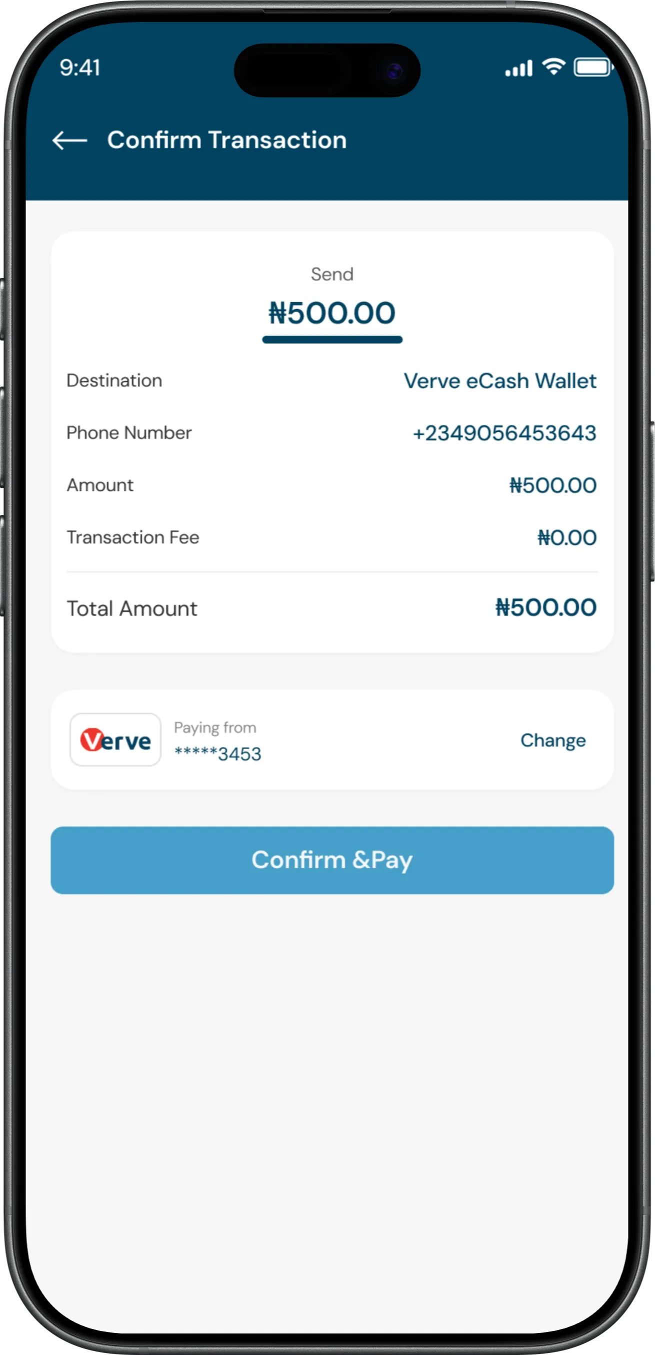
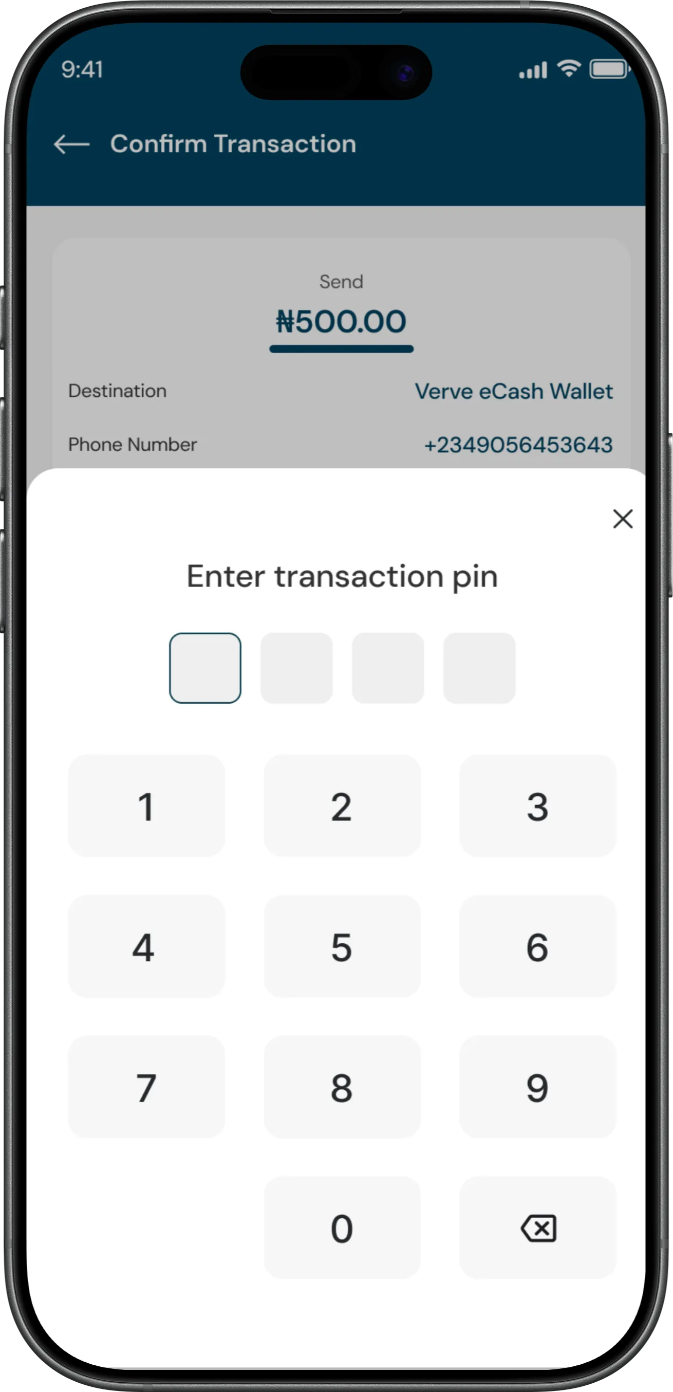
Other Screens
Conclusion
This project began with curiosity and a desire to understand QuickTeller beyond its interface. What I discovered was a product with strong capabilities but several usability challenges affecting the overall experience.
My goal wasn't to reinvent QuickTeller, but to improve what already existed. Every design decision was driven by a specific problem identified during the audit, focusing on clarity, consistency, accessibility, and better transaction flows.
My biggest takeaway was that great product design goes beyond aesthetics. It's about understanding how a product behaves, questioning existing decisions, and creating experiences that truly make sense for users.
I chose QuickTeller because I believe in what Interswitch is building. This redesign reflects how I approach product design: with curiosity, intentionality, and a commitment to bridging the gap between strong product functionality and meaningful user experiences.